Petrnzi: Visual Branding & Site
I rebuilt my own brand from zero and shipped it as a product. Logo, color, type, a mascot, and the site you're reading this on.
The brief nobody gives you
A designer's own brand is the hardest job there is. No client to push against, no budget to blame, no brief to hide behind. Just you and your own taste, and the quiet problem underneath it: if you can't make your own identity hold together, you have no business charging anyone to fix theirs. So I treated myself like a client. One identity, one voice, applied to something real and public: a working site, not a slide.
One discipline, not four
I design how a brand is seen and build how it works. For me visual identity, websites and interfaces are the same discipline. Branding, motion, 3D and creative coding end up as one job, instead of four handed to four people who never talk to each other. That belief is the reason this project is a site and not a logo sitting on a grey background. The brand and the build are the same decision, made twice. AI lives inside the process as an instrument. It moves faster, it fills gaps, it never decides. Taste still has to come from somewhere.
The mark
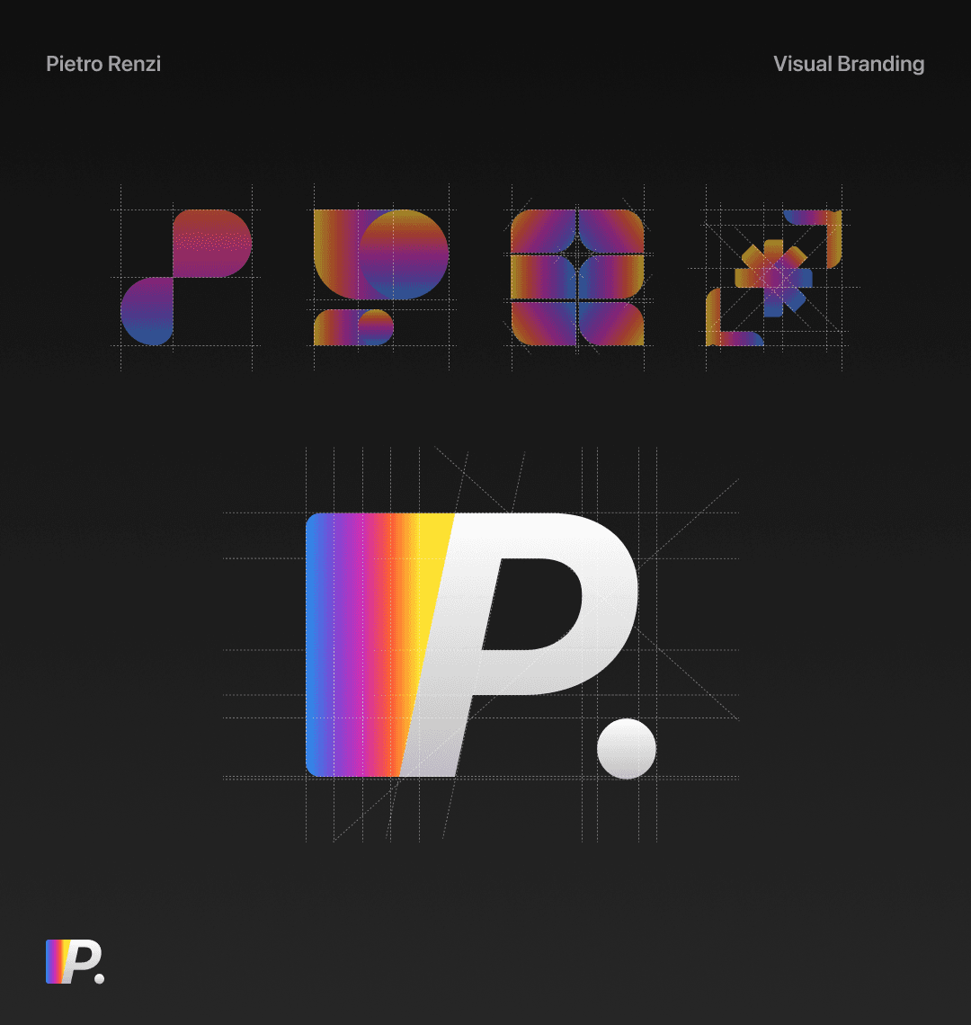
The logo is a P. with a spectrum cut into it. The reference sitting under it is Polaroid: that old rainbow band running down the side of a square, the most optimistic logo of its era. I wanted the same hit of color, but continuous instead of striped, and folded into a single letter instead of parked beside it. I drew four directions before this one. Most of them tried too hard. I kept the one that still held up small, because a mark that dies at favicon size is an illustration, not a logo. The spectrum carries the energy. The white half carries the restraint. The dot is where it all lands.
One gradient, everything
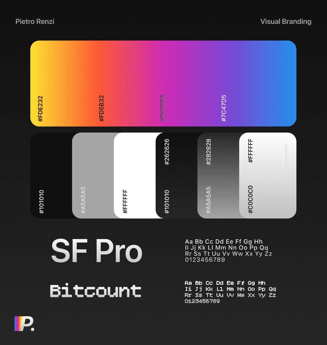
The entire identity is a single gradient. #FDE232 at one end, #2390EB at the other, every hue the spectrum passes through in between. Every color in the system is a slice of that one ramp, so nothing ever clashes, because nothing ever leaves the line. Two neutrals do the quiet work around it: near-black for surfaces, off-white for text. Type splits the same way. SF Pro for anything that has to be read without friction. Bitcount for the moments that should feel like a terminal: a timestamp, a status, a machine saying something out loud. One is clarity. The other is texture.
The thing that talks back
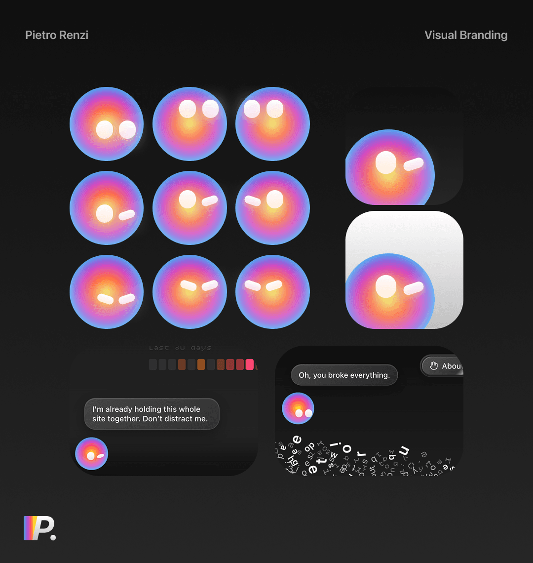
Most personal brands stop at a logo. I built a mascot. It's a small orb, the gradient compressed into a face, and it lives on the site, runs it, and is openly unhappy about the workload. It reacts to what you do. Leave it alone and it mutters, “I'm already holding this whole site together. Don't distract me.” Break something and the letters scatter off the screen while it tells you, “Oh, you broke everything.” It's the one piece of the identity with an opinion, and it's the piece people remember, because a gradient has no personality and this does.
The site is the proof
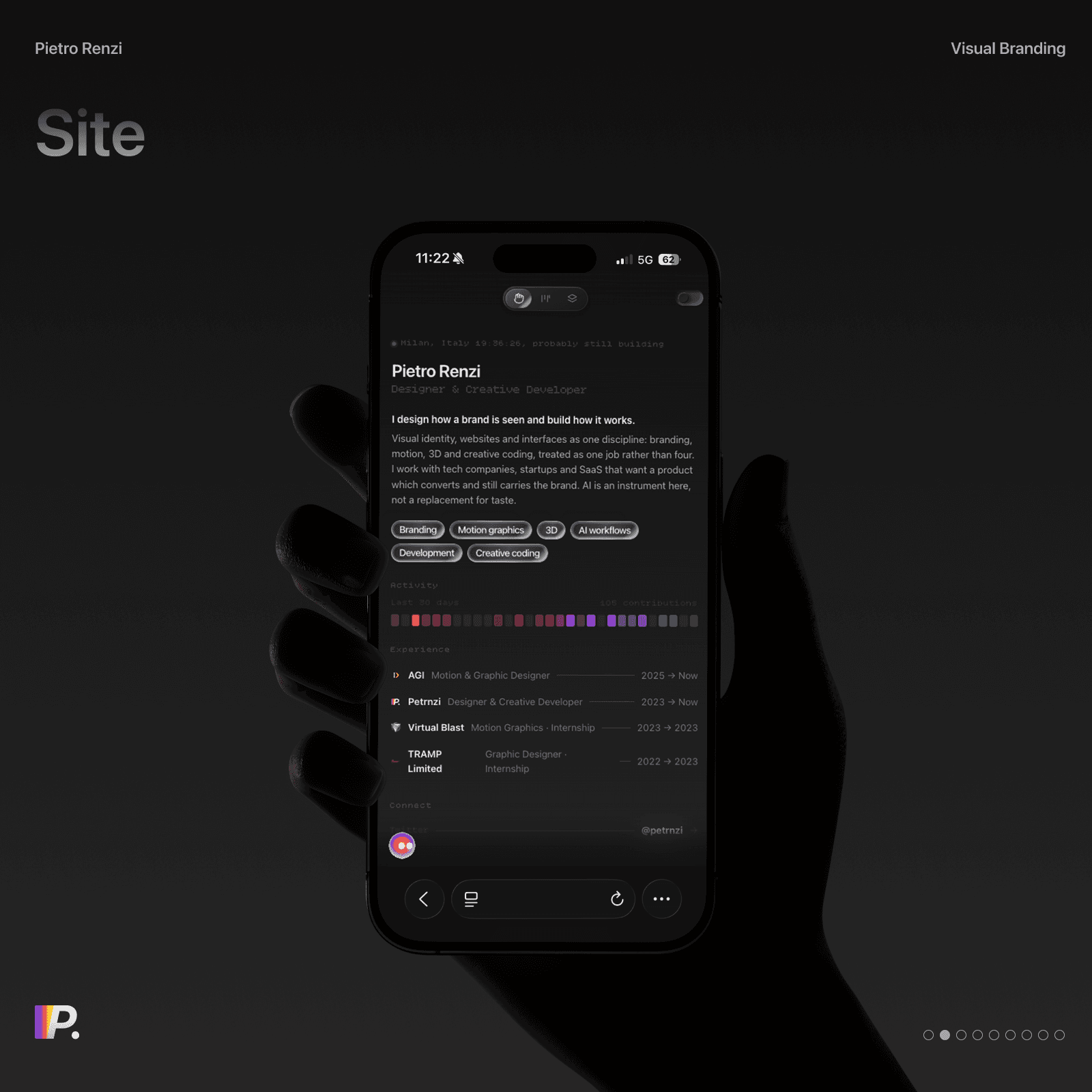
The about page behaves like a product. A status line at the top reads your local context back in real time and signs off with “probably still building”, because I usually am. Under the bio sits a 30-day activity graph in full spectrum, a hundred small squares of color where everyone else puts green. Experience, stack and contacts live on one dark surface you scroll through once. None of it is dropped into a template. It's coded, which is the whole point. A designer who says they can build should be able to show you the build, on their own domain, before asking you to trust them with yours.
In use
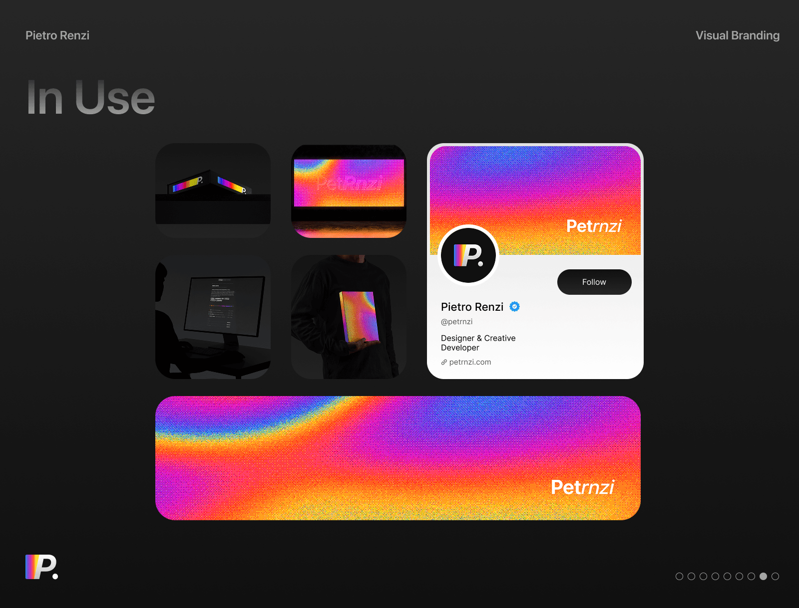
Then the boring, necessary test: does it survive the real world. On a screen, in print, on a profile card, on the objects you can actually hold. One system stretched across every surface it will have to live on, still recognisable when it gets there.
Where it lives
It's live at petrnzi.com. It will keep changing, because the status line isn't lying.
Credits
- Pietro Renzi
- SF Pro, Bitcount
- Figma, After Effects, React, Next.js, TypeScript, GSAP, Claude Code, Codex
- petrnzi.com/stack